Neo Samurai Mommy Issues
The Final Studio Document
In Neo Samurai Mommy Issues you play as the prince of Neo York City. In this game, you slowly navigate from the depths of the sewer, and climb your way to regaining the throne from the city’s tyrannical dictator, who happens to be your mother. There are 4 levels, each one increasing your arsenal with a different ninja ability. These consist of basic movement, attacking, climbing and dashing. It is up to you to climb to the top of the penthouse and carefully defeat the swarms of her armed guard. Will you be able to get to the top? Will you be able to stop your mother’s dictatorship? Play this game to discover how everything is not as it seems.
One of the main elements of the game we tackled was how it felt to be a ninja. The primary focus of that implementation was to impart that element into the movement abilities of the character. This implementation of movement is one of the primary systems within our game. Narrative was also a primary focus for this project. Another element is that the game was centered around “Mommy Issues,” and we were concerned about how to translate this correctly. What could, in theory, turn out as charming and self-aware could also contain hidden elements of deep discomfort. A final system we hoped to implement was worldbuilding through aesthetics. This game had a very specific color palette and feel we wanted to implement, and which most of the art itself captures well. These three systems are at the core of this project. While they were not translated as successfully as we would have liked, the design and intent of our project was centered around these three major pillars.
Heidi:
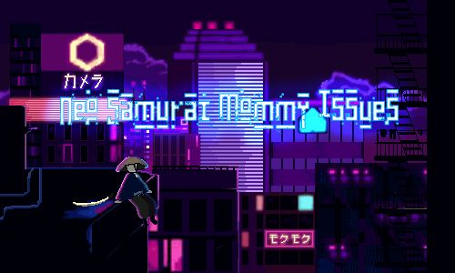
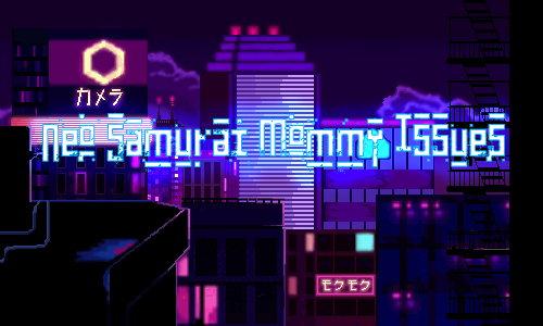
The role I had to do was the background art, title screen, and some UI sprite designs. Inspired by the game Katana Zero, we wanted to create a similar vibe. Sticking to a pixelated style but with a neon cyberpunk futuristic Japan city feel. The game starts off with the player being in a sewage level, then you go up to the city world, and then the top of the buildings.
To create this neon cyberpunk feel, I did some research on the color palette. The main colors in a cyberpunk world were blue, purple, and pink in many different shades. I wanted my pixel sprites and background to be semi-realistic. So although I know I barely had time, I wanted to put a lot of time and details into them to bring out this feeling of the game. To put a lot of details into the work, the sprite canvas would have to exceed 100 pixels. The title screen was put into a 300 by 500-pixel canvas. The other sprites I drew were around 300 pixels. In a neon cyberpunk world, there are a lot of buildings that have a lot of glowing signs, windows that are shining bright, and lights that are glowing on top of the buildings. But they all stay within the color palette range. Nothing that goes in the green, yellow, orange color scheme. I really like how the city sprites came out and the title screen because it really stands out. If I had more time, I would love to animate the signs on the houses and have them moving.

(Before I had to split the buildings. The feel of what the city would have looked like)
The design process for the title screen was that I wanted to have the idea of the city being the main city be present in the game. It was ultimately the main level therefore, I thought adding it as the title screen with the samurai would be a good idea. Using the blue, purple, and pink color scheme, I drew a lot of different buildings in different shapes. Adding signs and then making a border along the signs to make it look neon and glowing. I don’t really know what the signs say though because I took whatever Japanese characters that seemed easy to write from the internet and drew them on. The text on the game name was a font that I thought would match the game. Something pixelated but also looks like it’s being broken? I added a blue border and a blue glow to make it look like a glowing sign.
For the sewage level, I wanted to use colors that go against the blue-purple and pink scheme. Something dark and colors that don’t stand out. It’s the sewage (under the city) so it should be pretty dark. Therefore, I drew the tilemaps as dark green, brown, gray, and black. I took a lot of inspiration on the internet and drew the tilemap like bricks that are getting dirty and old. I think out of all the scenes and sprites I drew, I put fewer details or effort on the sewage level which I regret. I spent a lot of time working on the city and trying to bring out the cyberpunk Japan city feel in which there are probably fewer details on the sewage level. For example, I would have liked to put dirty green moldy water on the side, or chains hanging from the ceiling or more sewage pipes.

(some sprites and tilemap for the sewage level. The general gist and how dark the sewage would look like)
The challenges I faced were the fact that I wouldn’t be able to see how the world would look if the buildings were placed together. I had difficulty with Github working therefore my level building role was passed onto Caleb. If only my Github worked, I would have liked to create the world based on how I imagined it. Not to mention, I drew all my buildings in one big canvas. All the buildings were stuck together instead of being separate. Only 2 weeks into the project, I realized that separating the buildings would take less time and make the world building easier. Also, my drawing tablet broke at the beginning of the project, so I drew all of these with a trackpad or mouse. The canvas was so big and I wanted to add a lot of details into this which definitely took a lot more time than I thought. But because I dealt with such difficulty, I learned how to manage my time by separating the sprites and I learned a lot of pixel art which I really enjoy doing nowadays.
All in all, I really enjoyed making the background art for Neo Samurai Mommy Issues. If I had more time and my Github worked, I would love to do the level design and bring out more of these scenes to make the game more interesting. A game wouldn’t be a game without the aesthetics too. I learned a lot from doing this project, and doing the art portion of making games is something I really enjoy all in all. This is a game I would love to go back to and add more to the parts that I thought were lacking.
Clare:
For Neo Samurai Mommy Issues, I took on the role of character design and animation. I set out to highlight the movement of the player's character, as gameplay was the main focus of this version of the game at the moment. For his walking sequence, I didn't want to add any effects or any pizzazz. For me, I envisioned his character being pretty low-key. He is a regular guy, who has some issues like the rest of us. Even though the game is set in a futuristic environment and he is a samurai bounty hunter, I wanted to give the impression that he has a job to make ends meet like any other person. He doesn't need to spruce up his movement to showcase any strength.
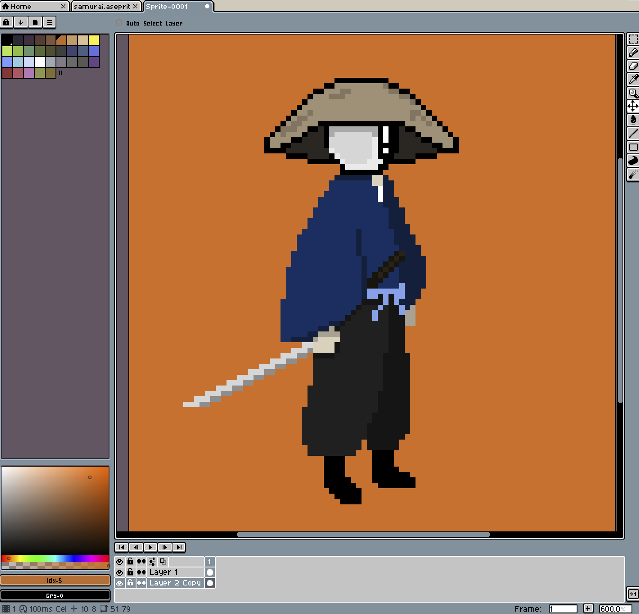 I also emphasized this vibe for the animation for the title screen, in which his sword is resting beside him, and he is swinging his legs back and forth looking across the city on a high ledge. He is relaxed here, and enjoying the view as any one of us would do. For the jumping animation, there is some subtle particles to showcase action without distracting the player from the level. I took the advice of animating on twos instead of ones, and since that animation sequence had the most frames out of all of them, it turned into a very long animation. I was concerned that this would take away from any sense of fast-paced motion. Then again, there is no running animation, which I want to create and implement in a future build. His attack animation has less keyframes than I intended for time's sake. I kept it simple, knowing that there was no special attack or anything of the like implemented in the character controller at the moment. We also decided to cut a crouch/crouch walk animation, since there is no stealth section and it would've been unnecessary. Streamlining animating in this way was immensely helpful, as I was initially planning on animating every frame of movement. While technically more thorough, this would've actually been counterintuitive in terms of creating interesting transitions of movement (only using keyframes for fast motions create the illusion of speed, as your eye fills in the blanks and assumes the in-between motion.) Animations that I am creating now are the wall grab/wall climb, as well as a running animation. There was some misinterpretation on my part for the title screen, as I drew and animated the main character sitting on the ledge without actually looking at the ledge itself that Heidi had already drawn because I was rushing. Because of my panic, there's a detail of his hand floating midair where I assumed the ledge would continue onto, but it cut off sooner than I had assumed. I want to fix this in the future build as well. Working without a reference, in my opinion, isn't the smartest for an inexperienced animator/artist like myself, but is what my process usually is. I didn't look at any examples of movements of animated (pixel or otherwise) characters from video games because I didn't want to influence the ideas I would come up with in terms of how the character would move by subconsciously mimicking any artwork I'd seen. However, I think that researching some references would've been helpful by saving me time/giving me a clearer idea of what the character's movement could look like/how I could streamline the animation itself.
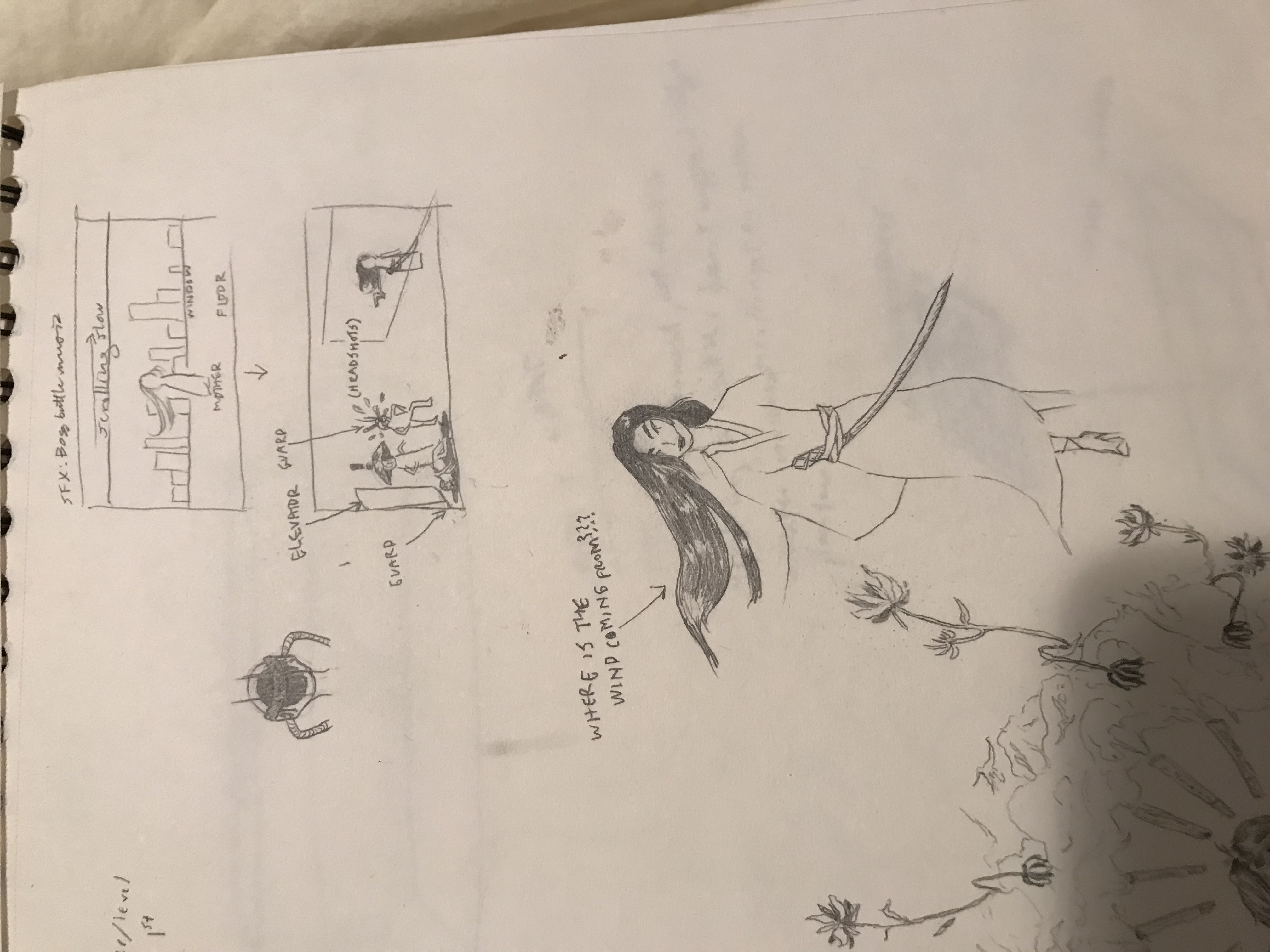
Initially, I was excited about having a dialogue system that would help flesh out a clear narrative to back up the game's title, but as time started running out, we decided that gameplay would take priority to actually complete it. Going forward, we want to further develop this game on our own time by adding different levels, more character movement, difficulty scaling throughout levels, and NPCs with their own dialogue system in place. Something that I'm excited to work on for the future builds is creating the boss level. I was set on having this for the current version, but couldn't meet the deadline. I have some initial sketches that I'm including below.
I really enjoyed creating a character from scratch and making him come to life, as well as imagining how he'd move in a space under different circumstances. It was like creating little movies in my head that I had to translate into the workspace. I also liked collaborating with my teammates to tweak his movements and backstory.
I definitely have a lot more to learn in terms of animating in a way that's efficient but still visually satisfying. Animating for this game was a step up from the last assignment (multiplayer Hansel & Gretel) even though I only did one character due to the wider range of movement required.
Caleb:
The primary role I had in this game was the Lead Programmer, Level Designer and Writer. As you play as a ninja, one of the main ideas I thought interesting to implement was that the further you went on your journey, the increased mobility options you would have access to. Dashes and wall climbing were the answers to many of these issues. One provided mobility when in the air, while the other increased the options of verticality in both movement and level design. I also implemented a wall-grab feature to help players navigate jumps more easily. Another element replicated the strategy of a ninja through an offensive sword attack. Enemy AI also was implemented to give combat a purpose. The enemy stands, searches for the player, and then attacks with either a close or long-range attack. I also implemented Parallax scrolling to this project, with the idea that it would better showcase the city backdrop. I also implemented a general health system so players had a clear understanding of their health in relation to enemy damage. Moving away from programming, level design was also important to look at. As the game centered around acquiring new abilities, I wanted the player to experiment with the project individually before adding it to the rest of their move set. Writing was also one of the main points of implementation for me to develop. I wanted to create a story that started with you on a noble quest to destroy your dictator mother, only to reveal over time that you are the problem, and she does what she does because of your immature actions.
I used many systems in place to achieve the effects stated above. I used state machines for both my player controller, and enemy ai scripts. Climbing walls in this game was implemented by having a game object in front of the player that constantly tracks if there is a “ground” layer object directly in front of the player. Once it collides the player then has the option to attach. This in turn stops gravity, allowing for a controlled up and down movement. The corner grab mechanic was also made through similar means, with a controller being made from a similar game object to determine your position in relation to the corner of colliders. Once it tracks this it freezes the player at a set starting position. Then, based on player input. it teleports you to the ending position based on the corner. An animation player during that process helps smooth this transition. The dash uses the idea to stop time, instead of gravity, as I wanted enemies to not be able to move while you were considering your dash position. What started as a slowed time effect eventually turned into a full stop as I realized it had an uncomfortable effect on the frame rate of the experience. Once you were frozen it based your dash direction on the angle of the current directional movement input. Enemies were used to a similar state machine system. The enemies start in an idle state where they are constantly searching on a set horizontal radius for the player. When it spots the player it determines how far away it is, and then either goes into a close range attack state, or a far range attack state. The close range acts identically to the player's sword slash. While the long range instantiates a bullet to be shot at the player. I also tried (and arguably failed) to implement a knockback system when hitting an enemy. This was done by simply having them push to the opposite direction of attack impact. I also selfishly tried to learn a few new implementation systems for this project. All player movement was done through unity’s new input manager. This forced me to reconstruct elements like basic movement to fit the new format. In terms of writing I created narrative exposition chunks in between each level that adequately explained what happened in between scenes, how to use the new ability, and further knowledge of the relationship between you and your mother. The basic level design structure was drawn out through a piece of paper, and then translated into unity through whiteboxing, and unity’s current grid system.
The primary challenge from this project arose from the implementation of state machines. There was a lot that I feel I didn't know at the start of this project. New Input systems, State Machines, general enemy AI. A lot of research has been done on these multiple system types, as well as how to program general player movement. That being said I think the main point of contention was scope. Unsure of what this project was to be, the new input system was one of the first systems I took to learn. At the time I thought that it made debugging and input navigation much simpler. Looking back I can tell I went there for more selfish reasons. I wanted to learn more about the system, even though the system itself didn't fit the project's scope (especially as we always had the joystick as the primary play in mind due to its primary relevance in previous Systems Lab projects). As a result all the work to learn and implement the system has been done, but it doesn't reap any of the benefits the system is designed to achieve. A dialogue system is something that was in our initial design for the game. Being initially quest and npc based, dialogue would act as a natural way to tell a story. Over time it would showcase how everyone hated the queen, and how you, her child, were the real person at fault. Due to time that implementation never came, and it resulted in a much weaker, scene transition-based narrative structure. The level design also could have been reworked. In the version played during class the corner grab was completely removed, rendering the game virtually impossible. This is due to miscommunication in the production chain. I received some of the important materials very late into development, and restructured the level design completely to try and combat corner grab. I eventually ran out of time, resulting in the wall climb still being in the version, causing a complete contradiction in terms. Looking back it would have been more smart to keep everything as it was, and strengthen some world building aesthetic layouts (as in backgrounds). I feel communication could have been improved, as a lot of the problems others were facing I didn't realize until it was too late to help fix them.
One of the main things this game needed was a dialogue system. It would have been the primary thing that transitioned a gameplay-focused experience into a narrative-focused one. At this moment the game is about a neo samurai. This change would bring the mommy issues to the forefront, and allow for simpler level design as the purpose would have changed. It would also have brought together the three main systems, and rebalanced the game’s purpose. That being said, there are a lot of simpler changes that could be made. Reimplementing what was lost in the last minute scramble is a given, decreasing the amount of buttons needed, and the general aesthetics would also have been a necessity. Finally we would work to smooth out the incredibly unforgiving difficulty scale.
I really enjoyed the process of developing this idea, both as ideology and through programming. Our group spent a long time on the ideal version of this game. I researched large scale systems to help support that ideal version. This act of creative “riffing” was strong, and I plan to work on this project further to create the version we originally set out to do. What I should have done instead is work for the realistic version, with realistic systems. It was so fun as a group to plan out and design a large scale system. It was even more fun for me to research different things I didn't know and successfully try to implement them, such as the new input manager and state machines. While looking back I wish I put a leash to stop myself, this large-scale research and implementation is what I enjoyed the most.
Closing words
At this moment this is a very gameplay-focused experience, and a difficult one at that. It stands up as a very hard old school-based platformer, with many pixel perfect jumps. While this is structurally unintentional, many over the years have grown to like extreme difficulty in games, and we feel this is a major selling point to that group. In terms of what the game could be, we have learned how to scale down an idealized version, and this game at the moment acts as the perfect basis for something larger. When the artwork comes together it works very well, even when there are other structural components missing.
This may sound like, and ultimately be, a negative reflection. But we all still think this game is worth checking out. It features a wide variety of controls and ways for the player to interact with the world, and the artwork on its own is incredibly well done.
Leave a comment
Log in with itch.io to leave a comment.