Neo Samurai Mommy Issues
Development Log (playtests, art and design)


Heidi:
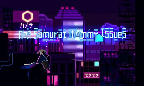
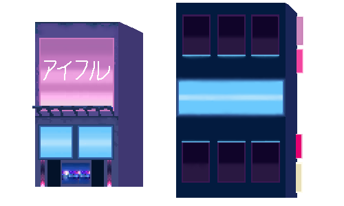
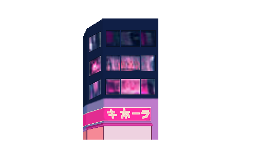
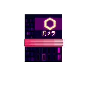
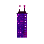
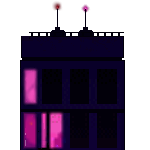
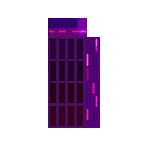
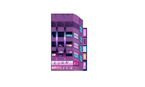
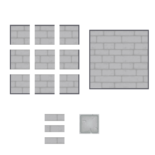
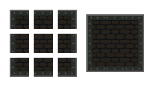
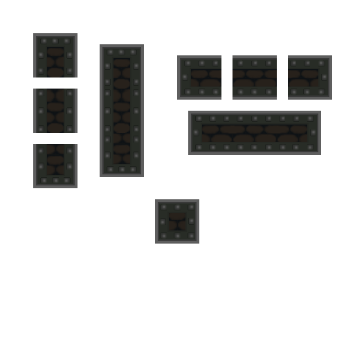
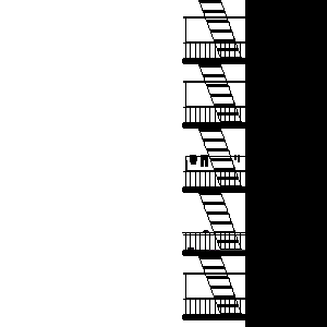
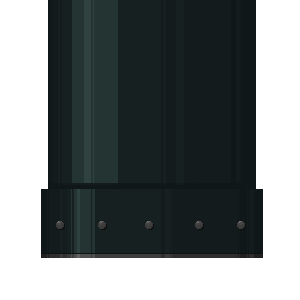
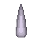
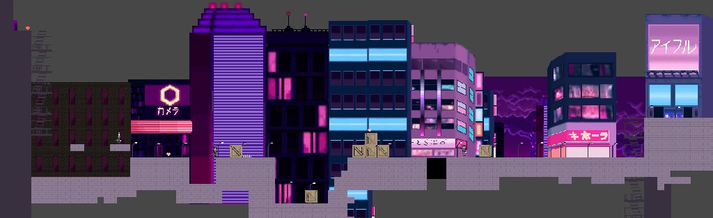
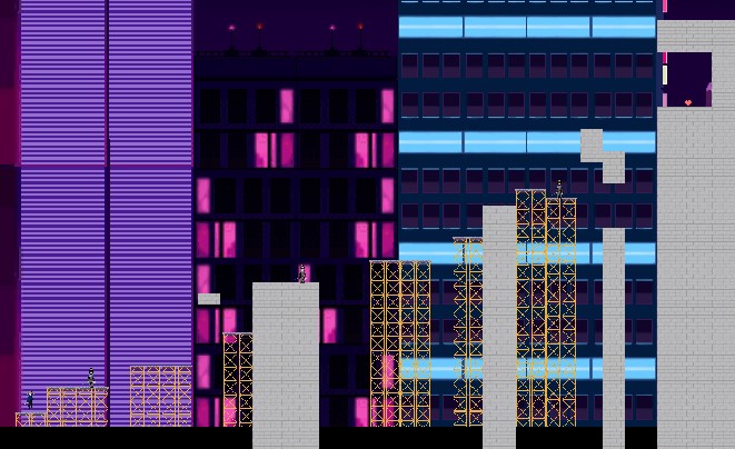
The role I had to do was the background art, title screen, and some UI sprite designs. Inspired by the game Katana Zero, we wanted to create a similar vibe. Sticking to a pixelated style but with a neon cyberpunk futuristic Japan city feel. The game starts off with the player being in a sewage level, then you go up to the city world, and then the top of the buildings.
To create this neon cyberpunk feel, I did some research on the color palette. The main colors in a cyberpunk world were blue, purple, and pink in many different shades. I wanted my pixel sprites and background to be semi-realistic. So although I know I barely had time, I wanted to put a lot of time and details into them to bring out this feeling of the game. To put a lot of details into the work, the sprite canvas would have to exceed 100 pixels. The title screen was put into a 300 by 500-pixel canvas. The other sprites I drew were around 300 pixels. In a neon cyberpunk world, there are a lot of buildings that have a lot of glowing signs, windows that are shining bright, and lights that are glowing on top of the buildings. But they all stay within the color palette range. Nothing that goes in the green, yellow, orange color scheme. I really like how the city sprites came out and the title screen because it really stands out. If I had more time, I would love to animate the signs on the houses and have them moving.

(Before I had to split the buildings. The feel of what the city would have looked like)
The design process for the title screen was that I wanted to have the idea of the city being the main city be present in the game. It was ultimately the main level therefore, I thought adding it as the title screen with the samurai would be a good idea. Using the blue, purple, and pink color scheme, I drew a lot of different buildings in different shapes. Adding signs and then making a border along the signs to make it look neon and glowing. I don’t really know what the signs say though because I took whatever Japanese characters that seemed easy to write from the internet and drew them on. The text on the game name was a font that I thought would match the game. Something pixelated but also looks like it’s being broken? I added a blue border and a blue glow to make it look like a glowing sign.
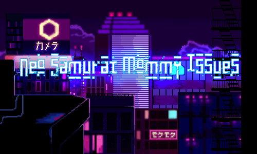
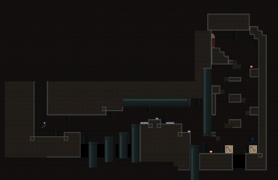
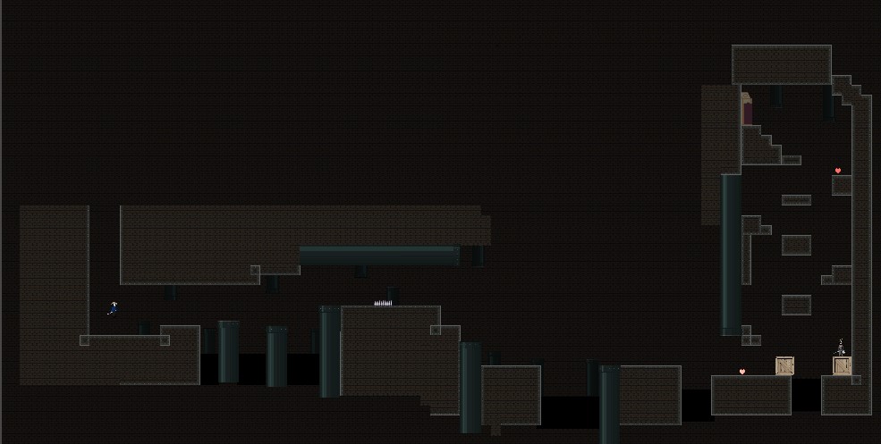
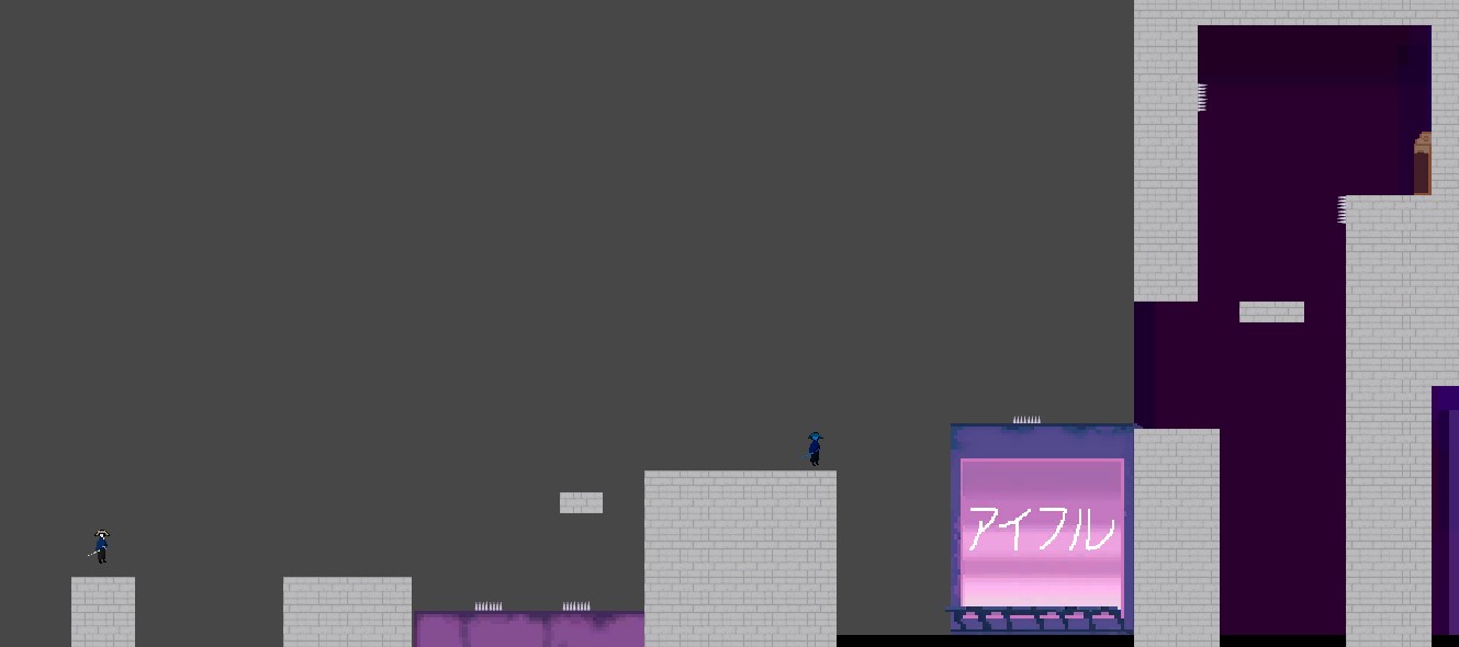
For the sewage level, I wanted to use colors that go against the blue-purple and pink scheme. Something dark and colors that don’t stand out. It’s the sewage (under the city) so it should be pretty dark. Therefore, I drew the tilemaps as dark green, brown, gray, and black. I took a lot of inspiration on the internet and drew the tilemap like bricks that are getting dirty and old. I think out of all the scenes and sprites I drew, I put fewer details or effort on the sewage level which I regret. I spent a lot of time working on the city and trying to bring out the cyberpunk Japan city feel in which there are probably fewer details on the sewage level. For example, I would have liked to put dirty green moldy water on the side, or chains hanging from the ceiling or more sewage pipes.


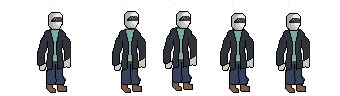
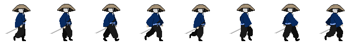
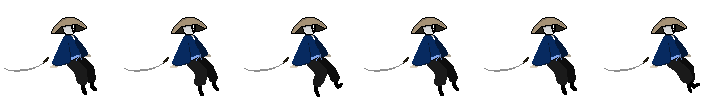
Clare Animations:


PlayTest Notes:
- more levels that take awhile to get through
- make enemy and character sprites and fix glitches and animation asap
- sorting layer (ui getting stuck)
- frame rate when falling down from jump
- alternative key for trigger ??
- reduce the number of buttons needed so it can help the players (pressing jump while pressing forward, pressing jump while touching the wall, etc)
- background changing
- directions or instruction of what you’re able to do
- animation change with the character jumping off
- climbing (add more climbing level designs to the world)
- incorporate other abilities into the further levels. Don’t only make it focused on one ablilty and not be able to use it for the next levels
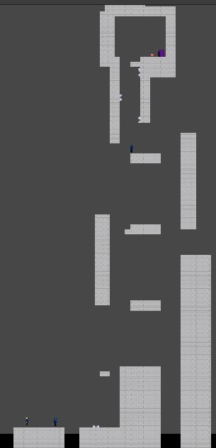
Level Design (Origional Sheet, before and After).


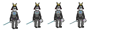
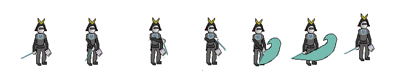
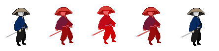
Caleb sprites: